

Aesop Rozu
Rozu is a new fragrance by Aesop and Barnabé Fillion, that is directly inspired by Charlotte Perriand, a modernist French designer and architect. While working alongside Le Corbusier, she created some of the most iconic spacial and furniture designs of the 20th century. Her joyful defiance of norms by juxtaposing masculine materials and egalitarian techniques with a feminine joi de vivre, made her an enduring icon. Rozu represents a unique blend of feminine and masculine energy, as embodied by Charlotte Perriand.
For the packaging design, I consulted Le Corbusier’s 1939 Color Keyboard to identify a broad palette that was designed specifically for architectural harmony. Utilizing this, I engaged Jonathan McCabe to produce a generative artwork that draws on the perfume’s key ingredients.
Rozu fragrance is designed as the missing key stone in Aesop’s long established triad fragrance profile. The theory behind the outter carton shade of pink is the completion of a tetratic color scheme between that of Hwyl, Tacit and Marrakech. Like Aesop’s olfactory profile, each of the four colors are distributed evenly around the color wheel with no clear dominance of one over the other.
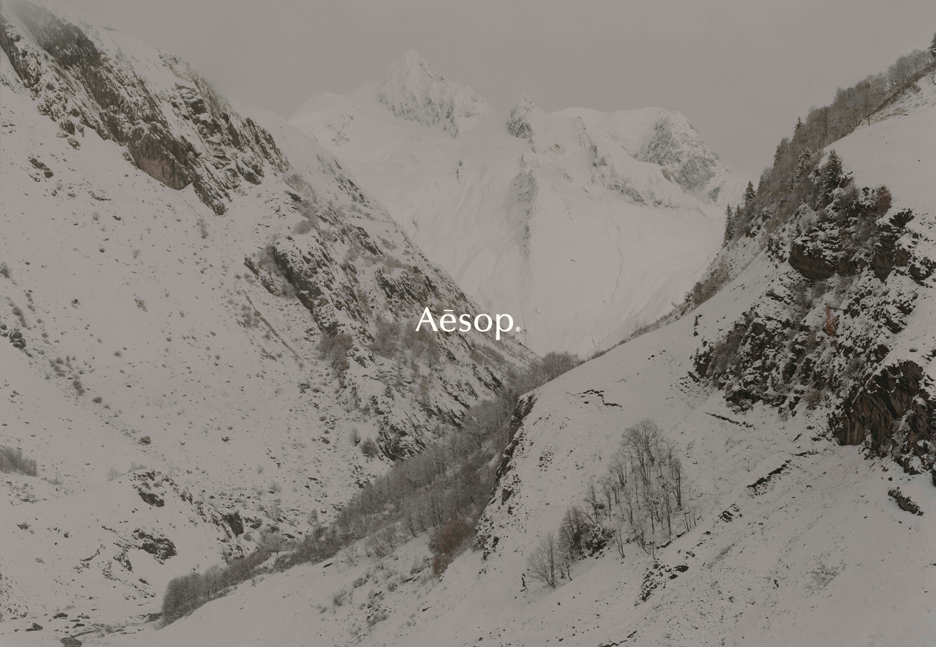
The campaign surrounding the release of the fragrance aimed to link all elements together. Set at Chalet Meribel in the French Alps, a series of photographs were captured by Julien T. Hamon bringing the fragrance ingredients to life alongside Charlotte’s most iconic spacial and furniture designs.
Creative Direction: Marsha Meredith
Art Direction: Lauren Hodges, Camille Legrand
Illustration: Jonathan McCabe
Photography: Julian T. Hamon
Film: Olivier Severe
Archival imagery courtesy of Perriand Foundation


‘Everything is linked, the body and the mind; mankind and the world; the earth and the sky.’ Charlotte Perriand